Hurricane and Tornado Risk, 1900-2000
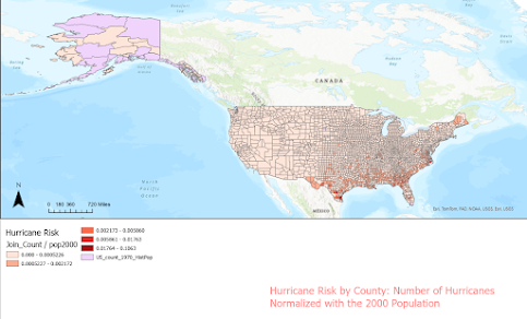
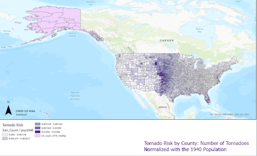
I would recommend treating this as more of a slide show than one single post, I created a lot of maps and it would be a little confusing to see them all at once, they are all labeled with the correct information about them. I noticed a distinct pattern, with more hurricanes in the Southeast, and more tornadoes in the Midwest. This is consistent with expectations, at least with what I know about weather.
The first map for each set, tornadoes vs. hurricanes, shows the join count as a graduated choropleth map, the darker the orange/red, the more hurricanes were recorded in that county between the years that the hurricanes were recorded (1851-2016). Tornadoes, the same is true in purple for the first map. These were recorded in the years (1950-2023).
I have considered that it doesn't make sense to include the population compared to tornadoes from 1900 and 1940, but I think it is still a useful comparison, assuming the weather patterns did not change to drastically in those 50 years.
Notice how the settlement patterns that we know in the US today become clearer as we see people along the East Coast and Gulf change over time, with still a risk of hurricanes in that area. The same is true for tornadoes in the Midwest. Since the number of tornadoes measured for each county remains the same, and the normalization changes (population), we see how the population of certain counties increased in the Midwest, consequently increasing tornado risk.


Very nice and thorough maps! I think you did an excellent job with this assignment! The only thing I am left wondering is whether the risk was based on the same year used for population data or if this was an overall risk statistic (it is hard to read the percentages for this portion of the legend as Blogger has issues with maintaining high quality images).
ReplyDeleteI really like how you showed the hurricanes and tornados from each year in separate maps. I did this as well because I find it much easier to male sense of all of the data. Great job with these maps!
ReplyDeleteI really like how you included a lot of maps but tied them together nicely. It is very easy to read visually, especially how you made sure the view and layout was the same for every map. I like the touch of matching the title to the color scheme, it really adds a level of cohesion and thought to your maps.
ReplyDeleteYour maps are very nice. You clearly convey the information through both the map and the legend and titles. I think that using a choropleth map was the best way to represent your data and it looks well made, especially associating hurricanes and tornados with different colors. It made a series of many maps look like they belonged together.
ReplyDelete